SAFE PROUDCASE STUDY
SAFEPROUD IS DESIGNED TO AID COMPANIES IN PROMOTING HSEQ WITHIN THEIR BUSINESS AND ENCOURAGES STAFF MEMBERS TO BE ACTIVELY INVOLVED WITH COMPLIANCE AND SAFE WORKING PRACTICES.
| Project Type | Integrated Mobile App & Custom Dashboard |
| Shakewell’s Service | Brand | Discovery | Design | Development | Project management |
| Technology | Laravel | Next JS | React Native |
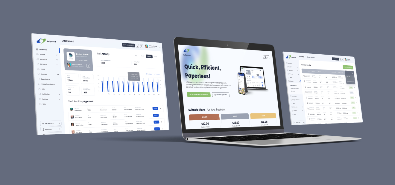
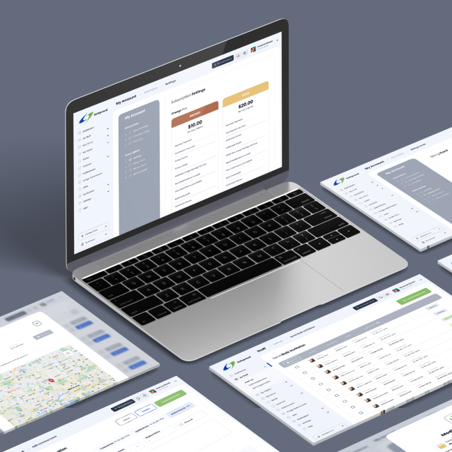
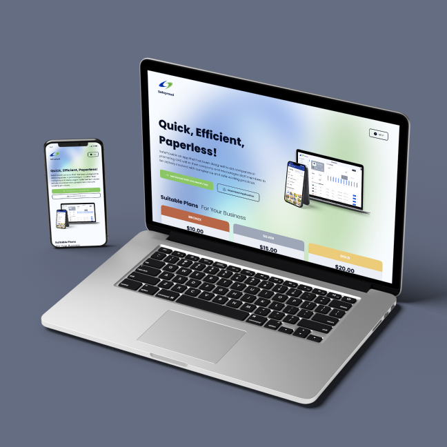
Managing OH&S, Safe work compliance, job progress and staff communication just got a whole lot easier with Safe Proud.
problem statement:
Every day, tradesmen have to fill out paperwork for safety, compliance and job site updates. The task can become mundane, but is a very important part of their daily tasks. But what if there was an easier way? Something that would contain all of your company's forms that were tailored to their needs and requirements, is easily accessible and kept digital records of all your paperwork…
SOLUTION:
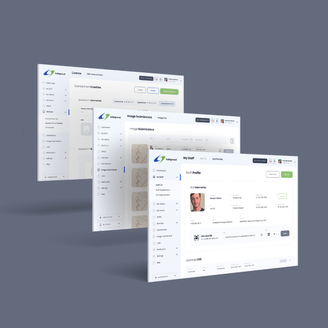
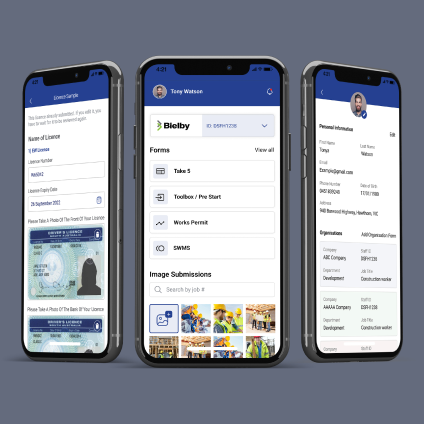
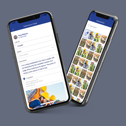
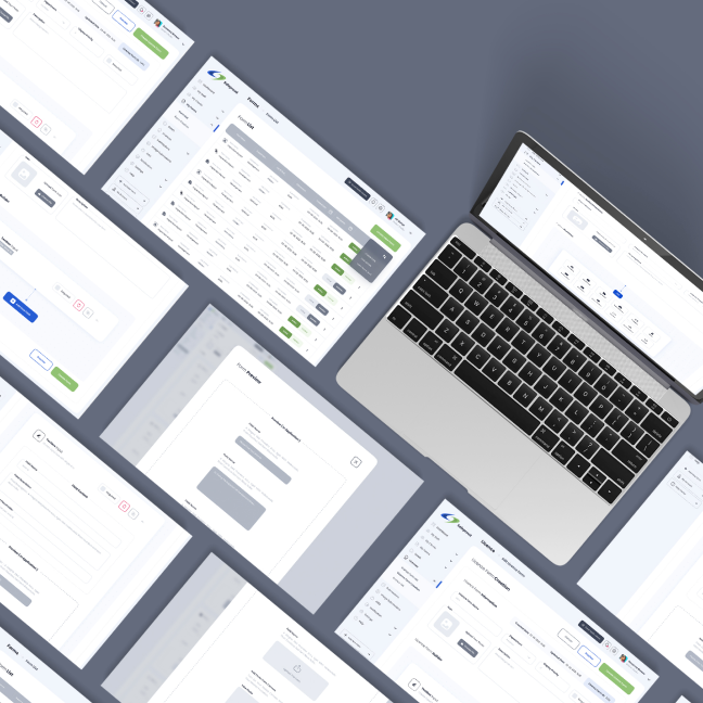
Safe Proud is an app and dashboard that connects admin and on-site
staff, with a click of a button. Providing customisable forms,
image submissions for job site updates and easily accessible record
keeping, Safe Proud replaces endless amounts of paperwork, with a
user friendly app.
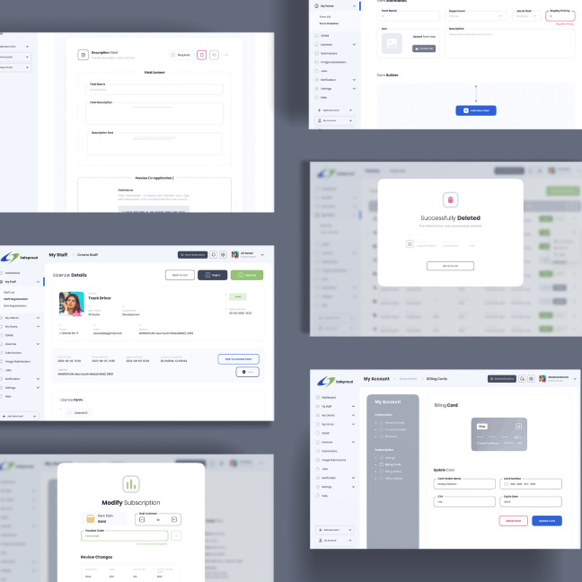
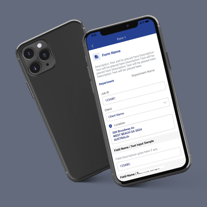
The dashboard form builder was designed alongside application designs,
to show the output of each customised form.
With numerous levels of functionality, the app connects admin and on site
staff with ease.
Our development team ensured there was a fast response time between the app and
dashboard, including image submissions, form submissions, notifications etc.
Our Process:
With the potential to reach many different types of companies, we needed to consider the different requirements and use cases. In particular, we included a form builder within the dashboard so the company could replicate the fields in their current forms. We researched numerous forms and the types of fields we would need to implement into the form builder, resulting in 12 different options. This ranged from input fields, date pickers, uploading images etc.
Each field needed to be customisable. For example, the dashboard needed to communicate that the headings, descriptions and input text were customisable.
This was a challenge, as we needed the dashboard to carefully step the admin staff through the form creation process, without overwhelming them.
We created a strong design system, carefully considering how each component can enhance the user experience within the dashboard. For example, with so many fields being customisable, we needed a way to indicate the required fields, without overwhelming the user.
We solved this by creating a new section for each field, so when a user selects “Multiple Choice” they are only presented with the fields for multiple choice. The design is subtle, yet clearly indicates each new section.
Further, we decided to use labelled input fields, to indicate what information we needed. For example, instead of a question saying “what is the title of this field?”, we simply added the label “field title” to the input field, so the user understands to enter the title.
To further solve this the design team decided to implement an App preview, demonstrating how the question will appear in the app. This would allow administrators the ability to check their work, as they build the form.
We looked at other form builders, and recognised that there were too many instructions, creating a cramped and overwhelming experience.